A British designer-developer expands and updates one of San Francisco’s oldest Victorians while preserving its original charm
Interview by Andrew Romano
Photography by Adam Rouse
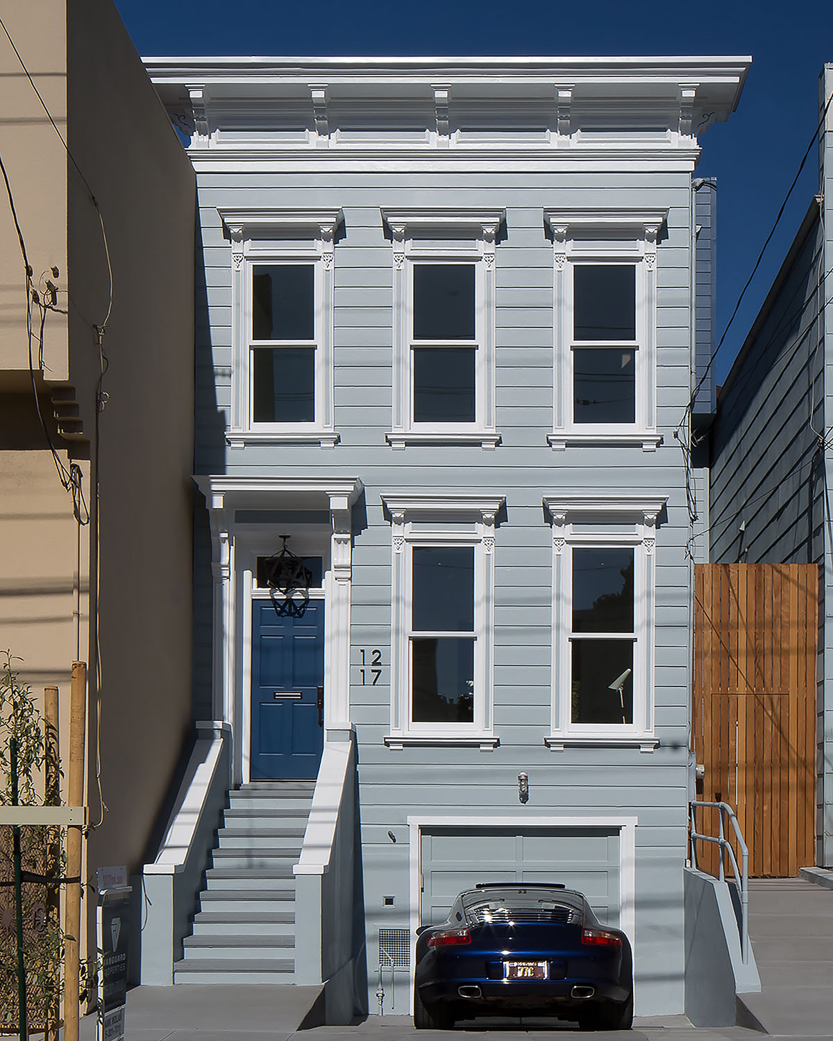
When suprstructur co-founder Jack Byron discovered a frozen-in-time 1875 Victorian in San Francisco’s hip Mission District, he knew what he didn’t want to do: gut it like every other developer in the city. Instead, Jack painstakingly restored its original details while complementing the existing spaces with a perfectly proportioned contemporary addition.
You have a law degree. How did you end up restoring and redesigning houses?
I figured out pretty quickly I didn’t want to be a lawyer. I’d always had an interest in architecture; I believe it was sparked at 18 by watching a BBC documentary about the Bauhaus. So I decided to get a master’s degree in architectural history and urban planning at the Bartlett School of Architecture in London. After that, I went to work in management with various architectural firms. I started off at Norman Foster, then Zaha Hadid. I worked for Philippe Starck, too.
Eventually, I wound up working for a developer who was uniquely focused on architecture. Then about 10 years ago, I decided I wanted to set up on my own. The ambition was to do small projects, one project at a time — the most interesting buildings we could afford. We weren't interested in demolishing stuff. We wanted to find diamonds in the rough and shine them up — either by restoring the architecture or contrasting it with contemporary additions.
You could call it a more European style of renovation and development. I grew up in the UK and Sweden. Our intention was to give our projects a bit of a different aesthetic.
My wife and I had always planned to come to California. We just took the plunge and did it. We completed a few projects in Los Angeles and then decided we wanted to live in San Francisco. We were interested in the architectural possibilities there. It's a dense city with very old, historic architecture. It has many similarities with London.
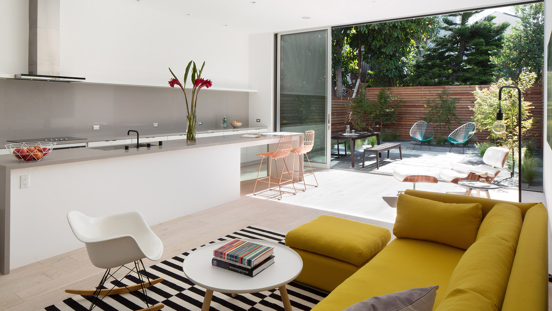
kitchen
And that’s when you found the house on York Street.
That’s right. We acquired this project in the Mission. The house dates from 1875, so even for San Francisco, that's pretty old. The lady who had lived there had passed away. She was in her 90s and the house had not been updated or touched since the early 1940s. The original architecture was all there.
Most of the bidders on this particular property were developers. The style of development in San Francisco is to preserve the front of the building, because that's required by the city, but then to tear out the interior: the old staircases, the original detailing and woodwork. To expunge that history so that once you walk in the front door, you don't have a clue that you're standing in a building that was actually once Victorian. That seemed a shame to us.
So we wrote a letter to that effect, and we won the bidding war. Our vision was to contrast the original house with a new addition.
That's the original hardwood staircase! Why would you take that out?
How did you actually go about realizing that vision?
Our approach was really to involve the city at the beginning — to be inclusive rather than confrontational and to work on a scheme that we knew would have a good chance of getting through the permitting process.
Through that we learned a few things that informed the design. One, the city doesn’t want people to do a pastiche — something that looks vaguely Victorian. They want it to be obvious that you've added onto the building.
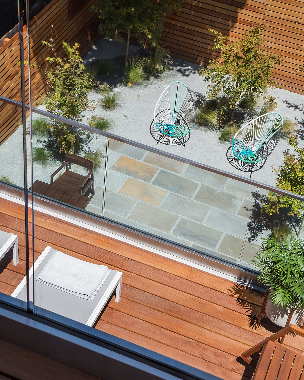
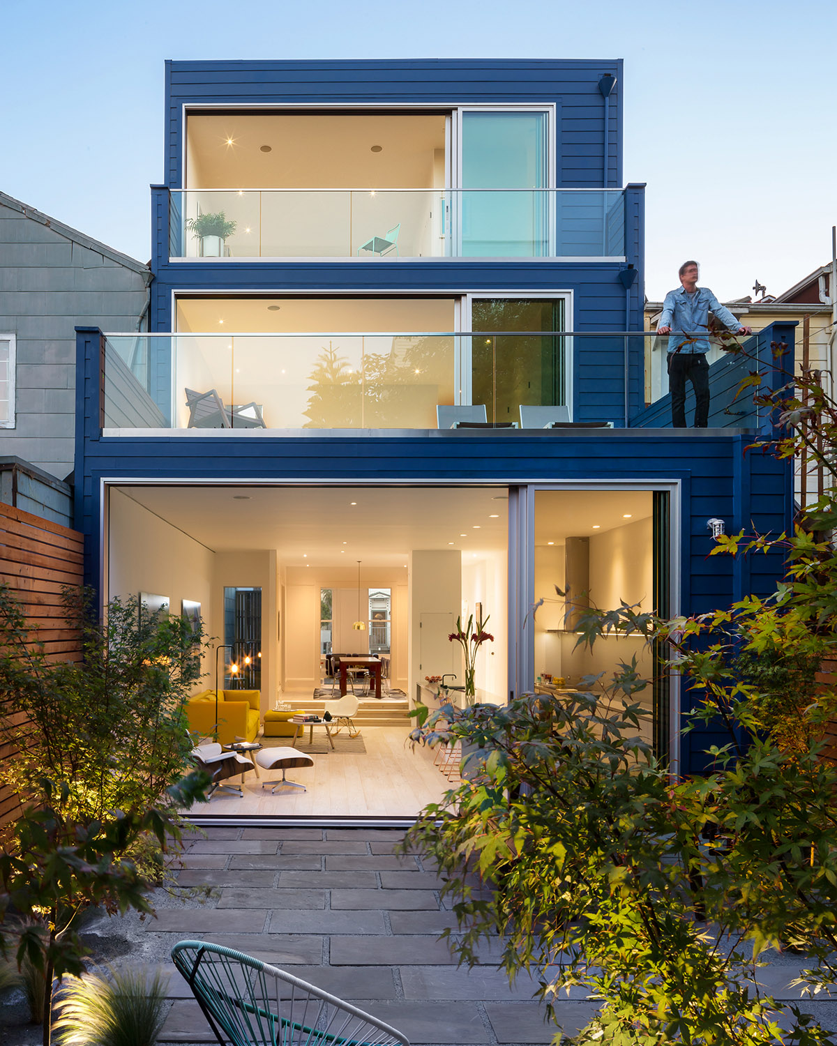
Two, they actually preferred that we add an extra story, so we wound up leaving the cube of the original two-story house intact and slotting into the back with a contemporary three-story addition.
Describe how the new and old elements combined.
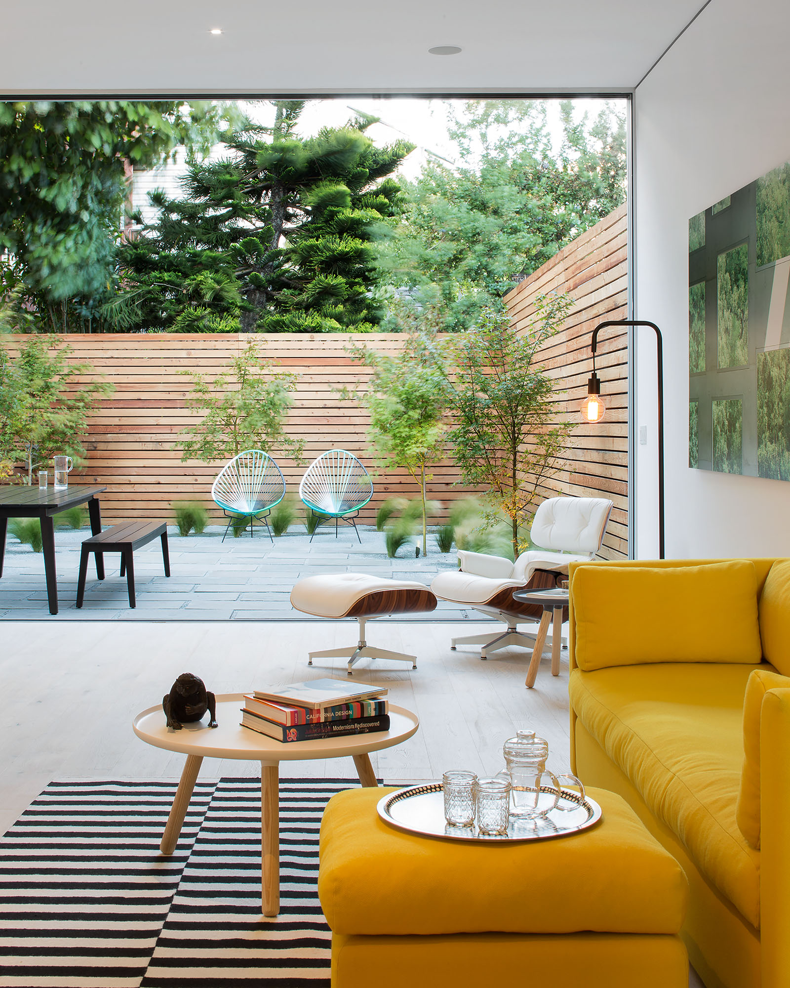
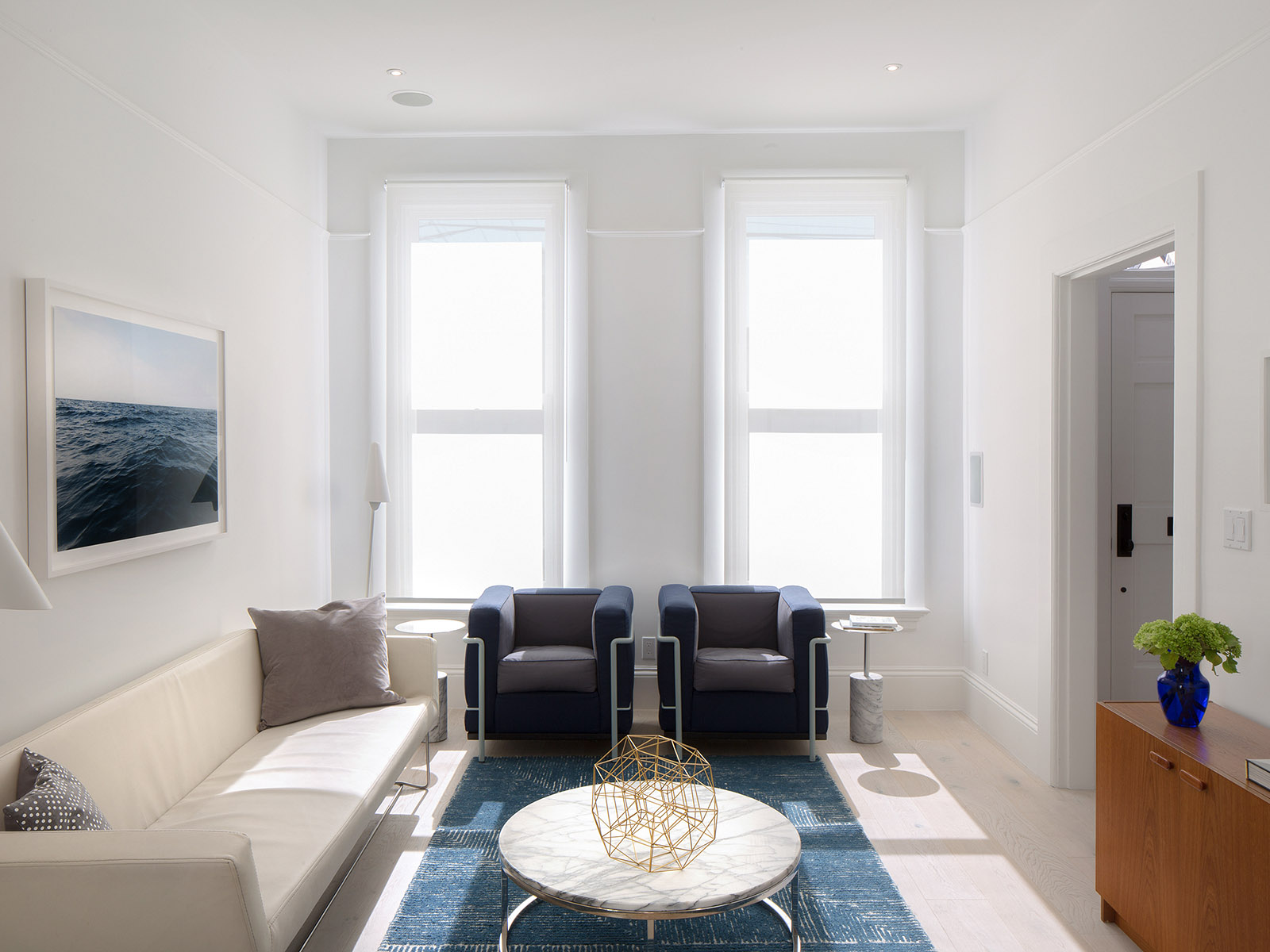
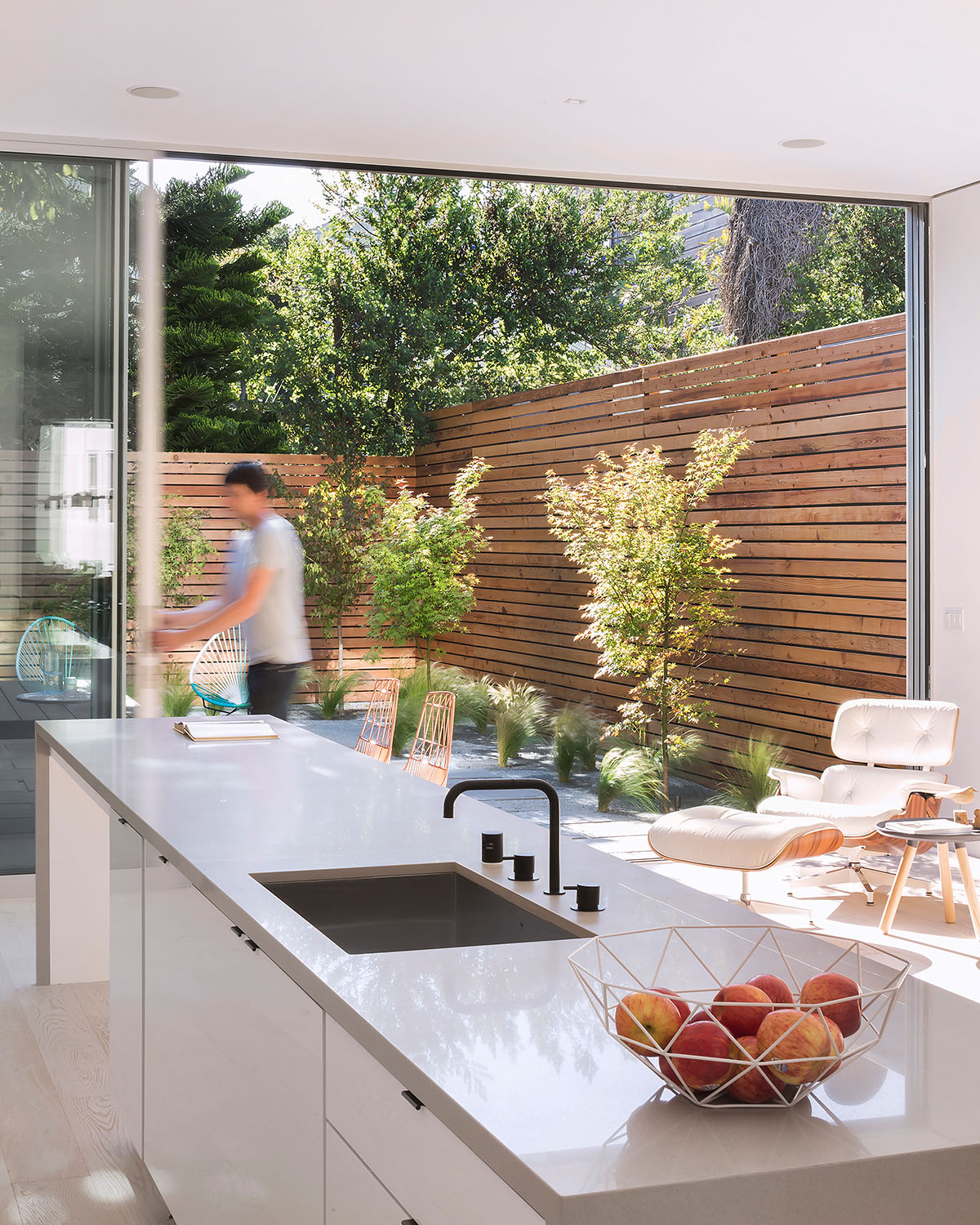
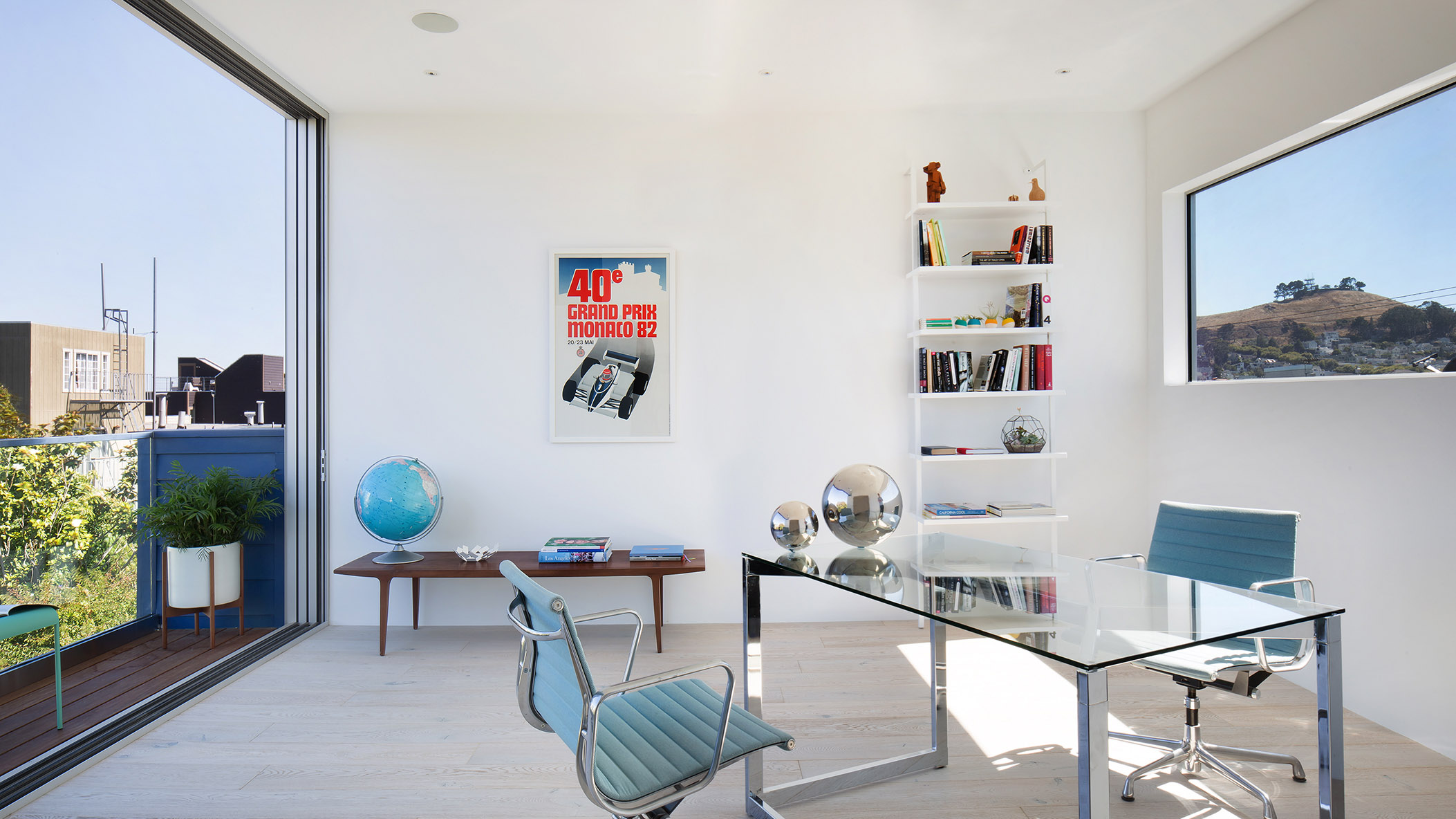
On the ground floor, there is an original sitting room, a dining room and a hallway and stairway up to the second floor. We felt it was important to have a succession of spaces. You know Frank Lloyd Wright's concept of embrace and release? This is a bit of the same. You pass through the original sitting room and dining room and enter into the new part of the house. To demarcate the difference, you first walk down a few steps. In addition, the traditional detail — the high skirting boards and the cornicing and the wooden ornamentation — disappears once you get into the new space, where it’s all smooth plaster junctions and contemporary detailing and floor-to-ceiling windows.
The ground floor tells a story: you go from old to new. We kept what we could. One of the original elements was the staircase. Our contractors were like, “You should tear that out and install something with glass." And we said, “That's the original hardwood staircase! Why would you take that out?”
As you step into the new space, the ceiling height goes from 9 or 10 feet to 11 or 11 and a half. It’s the kind of proportion you rarely find in domestic residential architecture — that very high ceiling in a very long room. From the front to the back of the house, it’s probably about 80 or 90 feet now. The idea was to open up the sight lines and produce a wonderful progression.
How about upstairs?
The bedroom with the three windows hasn't really changed. We kept the proportions of that, just as we kept the proportion of the two rooms downstairs. Then we added a new master bedroom with a deck facing the modern addition, and between those two rooms are two new bathrooms.
Finally, on the top floor there is a third bedroom or study with a widescreen window that frames the view west across San Francisco. The other side of the room overlooks the back garden with its own deck. The decks cascade down the back of the building.
You designed the interiors as well. How did you approach that challenge?
The idea with the interior was to have a very light, almost Japanese or Scandinavian palette that contrasts with the dark blue exterior. I really like strong contrasts. Speaking of, in the sitting room there is a photograph of the Pacific that I took very early one morning, and opposite that is another photograph of the sea taken in Denmark.
Was that juxtaposition deliberate?
It was. In many ways, it represents the spirit of the York Street house: a combination of the freedom of California design and the serenity of Scandinavia.